Launch
For brands that need a consistent, professional presence on social.
Ad budgetNone needed
- Content calendar and daily posting
- Comment and DM replies
GrowSales · Brand and UI guide
The system behind the GrowSales landing page: brand, logo, colour, type, layout, components, motion and the page frames at desktop, tablet and mobile. Use it to extend the site in Webflow and to brief new pages.
GrowSales sells growth that shows up in the sales report. Every word and visual on the site points at that, and away from vanity metrics.
Turn scrollers into customers.
The hero line. Use it once per page, with the zag under “customers”.
A digital marketing agency for growing brands. Social media, content, video and Meta Ads, run as one system and measured in sales.
D2C, fashion, beauty, restaurants, real estate, clinics, education and local retail, mostly in India. They have tried boosting posts or a freelancer and want one accountable team.
Reach, likes and followers come second. Every stat on the page is something a founder would see in their bank or order dashboard.
Three traits. Each one has a line we'd write and a line we wouldn't.
Say what we do in the words a shop owner uses.
Lead with the figure, then explain it.
Say who owns what, what it costs and what happens next.
One primary action across the site: the free audit. Never “Submit”, “Learn more” or “Contact us”.
| Where | Label | Style | Goes to |
|---|---|---|---|
| Hero, navbar, services, sticky mobile bar, footer | Book a free audit | Primary | #audit |
| Navbar under 480px | Free audit | Primary, small | #audit |
| Hero, second action | See results | Secondary | #results |
| Plan cards | Get a quote for Launch / Grow / Scale | Secondary, primary on Grow | #audit, plan pre-filled |
| Form steps 1 and 2, then submit | Continue, then Book my free audit | Primary | Next step, then success |
| Navbar, FAQ card, mobile menu | Chat on WhatsApp | Secondary or text | wa.me link (to add) |
The existing GrowSales mark is kept exactly as it is: a chat bubble on a navy tile with a rising arrow, in the indigo-to-emerald gradient. The wordmark is set in Inter.
Keep half the mark's height clear on every side. The full logo is never narrower than 120px; below that, use the mark alone (16px minimum).
| “Grow” | Inter 800, tracking −2%, Navy on light, #F0F2FF on navy |
| “Sales” | Inter 700, Indigo 600 on light, Periwinkle #A5B4FC on navy |
| Gap | Mark to wordmark: a quarter of the mark's width |
| Nav size | Mark 40px desktop, 34px mobile |
Recolour the wordmark.
Place it on the gradient or on photos.
Stretch or squash the mark.
Add glows, shadows or outlines.
Built from the existing logo: GrowSales indigo for action, emerald for growth, the logo's navy for weight, and cool fog neutrals tinted toward indigo. Click any swatch to copy its hex.
Indigo stays rare so it always means “act”. Emerald only marks growth.
Approximate share: fog and white 58 percent, navy 24, mist 11, indigo 4, emerald 3.
Names match the CSS variables and the Webflow variables.
#3D52E6Buttons, links, focus ring, emphasised words
#2F43D4Button hover and pressed
#5B6EF5GrowSales primary. Graphics, charts, eyebrow squares; not for small text
#8B9AF8Emphasis text on navy
#A5B4FC“Sales” in the wordmark on navy
#EEF0FFSelected tiles, GrowSales table column, plan chip
#10B981Growth on navy, “yes” marks, badges with navy text
#047857Growth text and bullets on light
#E7F8F1Positive chips and quick-win panels
#0B1220Headings, dark bands, featured plan
#111A2ECards on navy
#1A2540Chips and avatars on navy
#464D63Body text on light
#5D6480Captions, labels, mono text
#F3F4F8Page canvas
#FFFFFFCards, white bands, the form
#E7E9F5Plans band, mock-up panels
#DCE0F2Dividers and inactive bars on mist
#B45309“Learning” and “Sometimes” states
#FEF3C7Amber chip background
#B42318Form errors
Indigo 500 to Emerald 500, left to right. Only for the logo, the zag line and chart lines. Never a background fill.
Only inside creative mock-ups (posts, reels, ads, calendars). Never for UI, text or backgrounds.
Every text pair used on the page, measured against WCAG 2.2. AA needs 4.5:1 for body text and 3:1 for large text.
| Sample | Pair | Used for | Ratio | WCAG |
|---|---|---|---|---|
| Navy on Fog | Headings | 17.04 : 1 | AA | |
| Slate 600 on Fog | Body text | 7.64 : 1 | AA | |
| Slate 500 on Fog | Captions and labels | 5.31 : 1 | AA | |
| Slate 500 on Mist | Labels in mock-up panels | 4.83 : 1 | AA | |
| White on Indigo 600 | Button labels | 5.92 : 1 | AA | |
| White on Indigo 700 | Button labels on hover | 7.31 : 1 | AA | |
| Indigo 600 on Fog | Links, step times | 5.39 : 1 | AA | |
| Indigo 600 on Indigo 50 | Selected tiles, plan chip | 5.23 : 1 | AA | |
| Emerald 700 on White | Growth text, status | 5.48 : 1 | AA | |
| Emerald 700 on Emerald 50 | Positive chips | 4.99 : 1 | AA | |
| Amber 700 on Amber 50 | “Learning” pill | 4.51 : 1 | AA | |
| Red 700 on White | Form errors | 6.57 : 1 | AA | |
| Placeholder on White | Input placeholders | 4.55 : 1 | AA | |
| Fog text on Navy | Text on dark bands | 16.81 : 1 | AA | |
| Muted on Navy | Secondary text on dark | 8.67 : 1 | AA | |
| Muted on Navy 800 | Labels in case cards | 8.03 : 1 | AA | |
| Emerald 500 on Navy | Big stats on dark | 7.38 : 1 | AA | |
| Indigo 300 on Navy | Emphasis on dark | 7.20 : 1 | AA | |
| Navy on Emerald 500 | Badges, “Winner” tag | 7.38 : 1 | AA | |
| White on Indigo 500 | Not used for text | 4.21 : 1 | Large text only |
Three Google Fonts. A characterful grotesque for headlines, Inter for reading (it matches the existing wordmark) and a mono for labels and data, the language of the dashboards GrowSales reports from.
Display. Headings, stats, plan names and FAQ questions. Weights 600 to 700, optical size on.
₹ 4.2× 0123456789 & ?!Body and UI. Paragraphs, buttons, form fields, table text and the wordmark. Weights 400 to 800.
₹ 4.2× 0123456789 & ?!Utility. Eyebrows, labels, table heads, dates and chart axes. Uppercase with +6 to +8% tracking.
₹ 4.2× 0123456789 & ?!Sizes in px at the three design widths. Line height and tracking as set in the CSS.
| Style | Font · weight | 1512 | 768 | 393 | Line height · tracking |
|---|---|---|---|---|---|
| H1 display | Bricolage 700 | 80 | 60 | 42 | 0.98–1.02 · −3.5%, −3% on mobile |
| H2 section | Bricolage 650 | 56 | 44 | 34 | 1.04–1.08 · −3% |
| H2 closing (audit) | Bricolage 650 | 64 | 48 | 40 | 1.04 · −3% |
| H3 card | Bricolage 600 | 28 | 24 | 22 | 1.15 · −1.8% |
| H4 / FAQ question | Bricolage 600 | 21 | 20–21 | 18–19 | 1.25–1.35 · −1.5% |
| Stat numeral | Bricolage 650–700 | 56–64 | 48–64 | 36–52 | 0.95–1 · −3.5 to −4.5% |
| Lead | Inter 400 | 20 | 18 | 17 | 1.55 |
| Body | Inter 400 | 17 | 16 | 16 | 1.6 |
| Small / UI | Inter 400–600 | 14–15.5 | 14–15.5 | 13.5–14 | 1.4–1.5 |
| Button | Inter 600 | 16 (15 small) | 16 | 16 | 1 · −0.5% |
| Eyebrow / label | Fragment Mono 400, caps | 12.5 | 12.5 | 11.5 | 1.4 · +8% |
Desktop sizes.
Designed at 1512, 768 and 393, built on Webflow's breakpoints. One container, generous section rhythm, and grids that drop columns instead of shrinking content.
Spacing scale: 4, 8, 12, 16, 20, 24, 32, 40, 48, 64, 88 and 128 pixels.
Soft, app-like corners, because the work lives inside phones and dashboards. Hairlines separate; shadows are saved for things that float.
Two shadows only.
The brand device. It's the rising line inside the GrowSales mark, lifted out and reused. It stands for growth with a dip in it, which is how real campaigns look.
Gradient stroke under the emphasised word.
Every feature list and checklist.
Comparison table and legend.
The arrow flies out and the zag rises in.
Behind results, the audit band and covers.
Revenue and ROAS lines use the same gradient.
The parts the landing page is built from, with their states. Class names match the code, so they can be rebuilt one-to-one in Webflow.
button with combo classes. Height 56 (52 on mobile), small 44. Hover 200ms.
Labels above, 52px inputs, errors say how to fix it. Phone always has the +91 prefix and a line on why we ask.
Default
Focus
Enter a 10-digit mobile number, like 98765 43210.
First item open. The whole row is the button. Try it.
A 30-minute video call. We share what we found, three quick wins and a 90-day plan.
No. It's paid to Meta from your own ad account.
Plan and case cards as used on the page.
For brands that need a consistent, professional presence on social.
For brands ready to sell with video and Meta Ads.
return on ad spend within 90 days of launch
One big number in Emerald 500, one sentence saying what it means, three supporting metrics and the services used. Tag it Sample until the client approves real figures.
The page sits still; the campaign moves. Motion lives inside the hero visual and in small confirmations, and everything stops for people who prefer reduced motion.
| Moment | Spec | Reduced motion |
|---|---|---|
| Hover | 200–300ms, cubic-bezier(.215,.61,.355,1). Cards lift 3px, borders darken. | Colour change only |
| Button arrow | Arrow exits up-right, zag enters from bottom-left, 500ms cubic-bezier(.16,1,.3,1). Also on keyboard focus. | Kept (no travel) |
| Zag underline | Draws once on load, 1.15s, 350ms delay, expo ease. | Shown drawn |
| Hero feed | New order or DM slides in every 3.4s; the list keeps three. Pauses when the tab is hidden. | Static list |
| ROAS chart | Line draws once over 1.6s after 500ms. | Shown drawn |
| Counters | Count up once over 1.4s when 60% visible. Final values are in the HTML. | Final values only |
| Marquee | 48s per loop, linear, pauses on hover, edges fade. | Static |
| Process stepper | Pinned visual swaps when a step crosses the middle of the screen: 450ms fade + 14px rise. The rail fills with progress. | Instant swap |
| FAQ | Height via grid rows, 450ms. | Instant |
| Sticky mobile bar | Slides up after the hero CTAs leave the screen, hides over the audit form, 450ms expo. | Kept |
Hover or tab to the button. Replay the underline.
Show the work, not stock photos. Each service is illustrated with the thing GrowSales actually delivers: a calendar, a post grid, a shoot call sheet, an A/B test, a cost-per-sale chart.
Sharp at any size, light to load, and easy to edit in Webflow. Content colours appear only inside them.
Swap the hero reel for a real client ad: 9:16, 1080 × 1920, 8–15s loop, muted, with a poster frame and under 1.5MB.
Client logos greyscale on light and white on navy, about 32px tall. Testimonials need a photo, name, brand and one number.
24px grid, 1.8px stroke, round caps and joins, current colour. In tiles of 36–44px with a tinted fill.
What the page already does, so new sections keep doing it.
One at a time, two weeks or 300 form starts each.
| Test | Variant | Measure |
|---|---|---|
| Hero headline | “More sales from Instagram and Facebook.” | Form starts per visit |
| Primary CTA | “Get my free audit” | Hero CTA clicks |
| Form step 1 | Ask for the Instagram handle first | Step 1 to submit rate |
| Price signal | Show “plans from ₹X a month” on Plans | Qualified audits booked |
The coded page uses Client-First style names so it ports section by section. Tokens become Webflow variables.
| Colour | color/fog color/ink color/indigo … one per token in section 03 |
| Font | font/display font/body font/mono |
| Size | size/container 1280, size/gutter 48 / 40 / 20 |
| Radius | radius/button 14, radius/card 22, radius/panel 36 |
| Space | space/section 128 / 96 / 80 / 64 |
section_hero, section_services, section_results …hero_grid, service_visual, plan_pricebutton is-secondary, plan is-featuredis-active, is-open, is-visiblegoal budget services name brand phone email, hidden planLead event on success, mirrored through the Conversions API.The full landing page rendered at the three design widths. Scroll inside each frame. The live page also adapts between them.
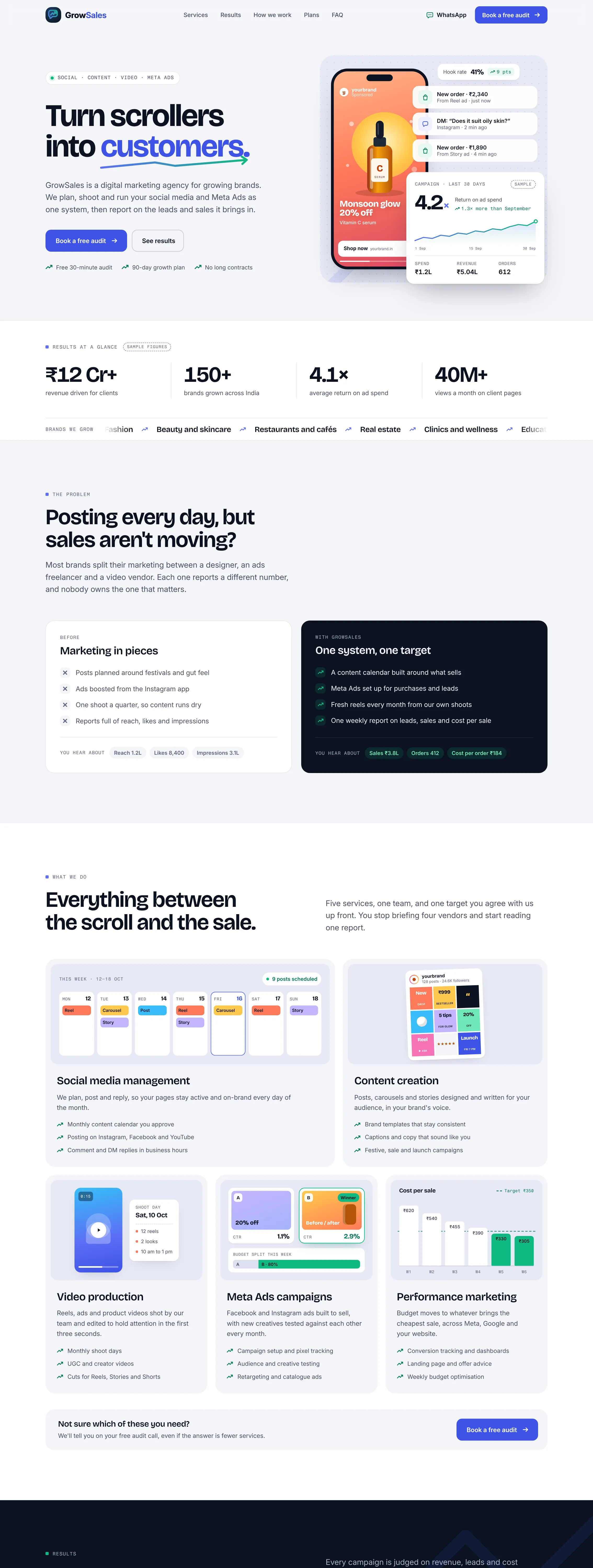
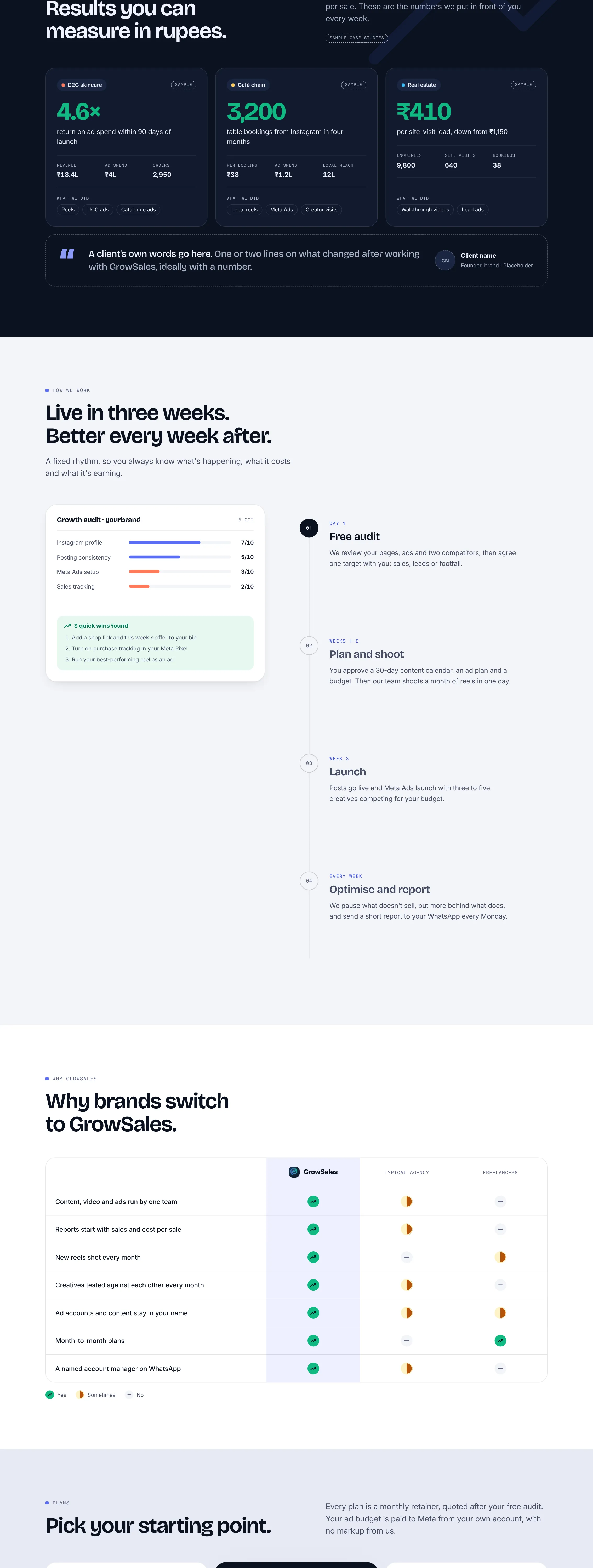
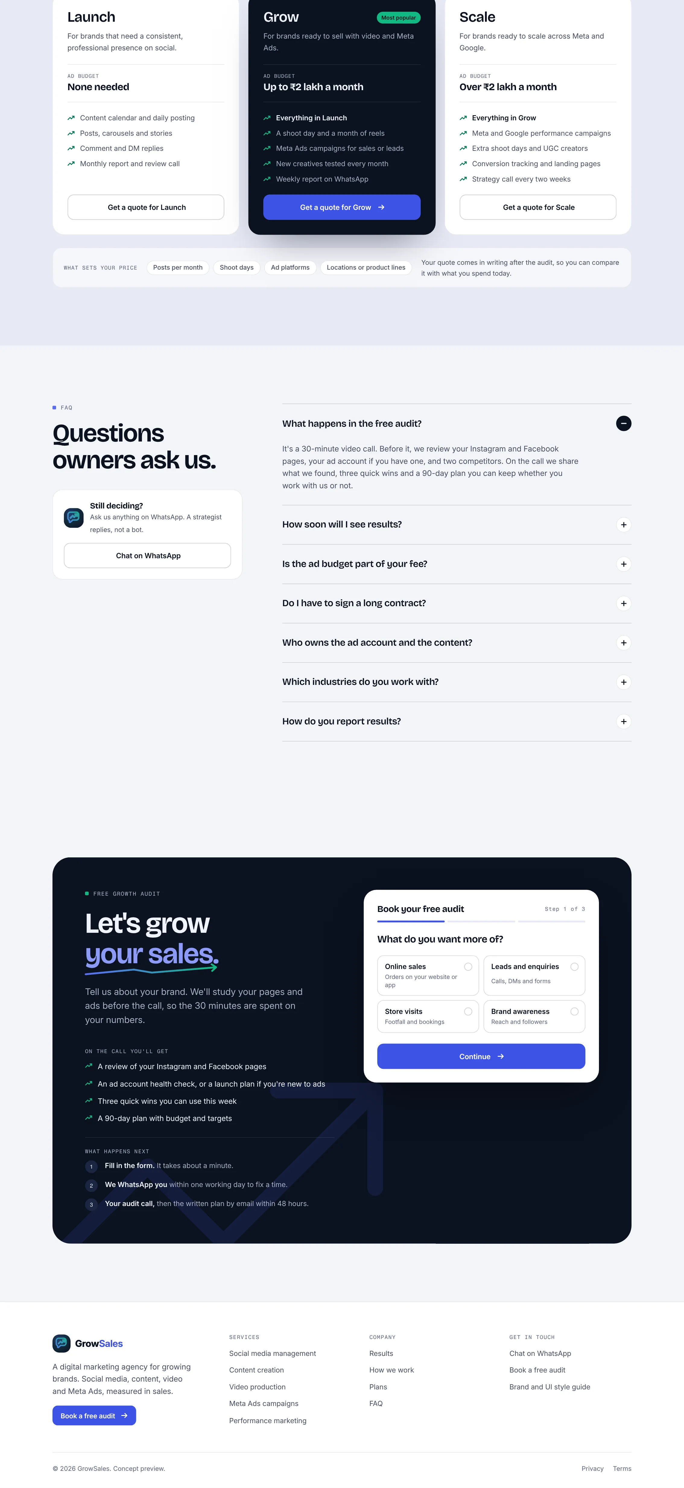
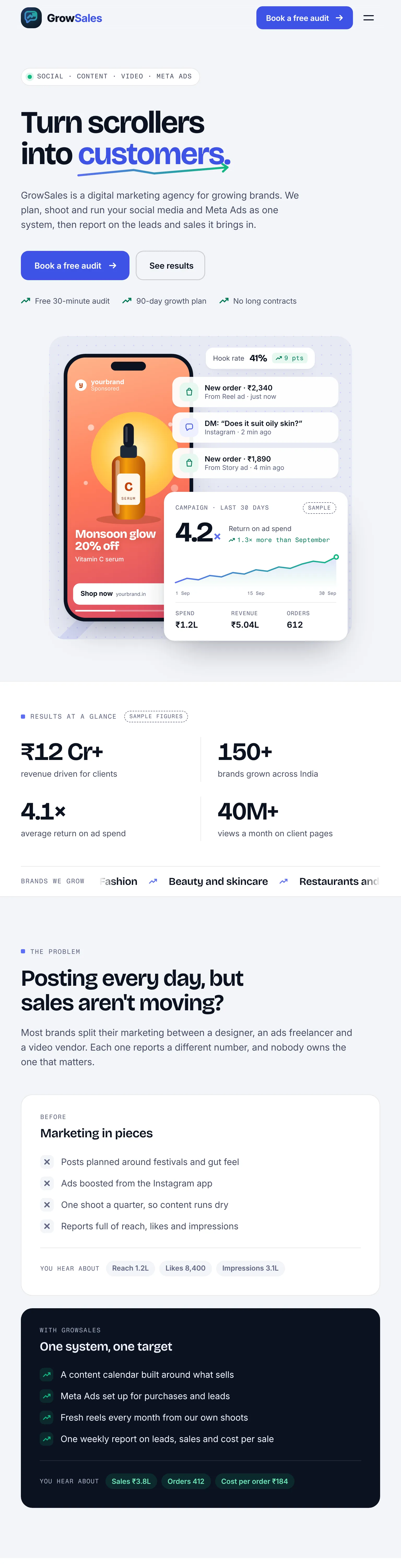
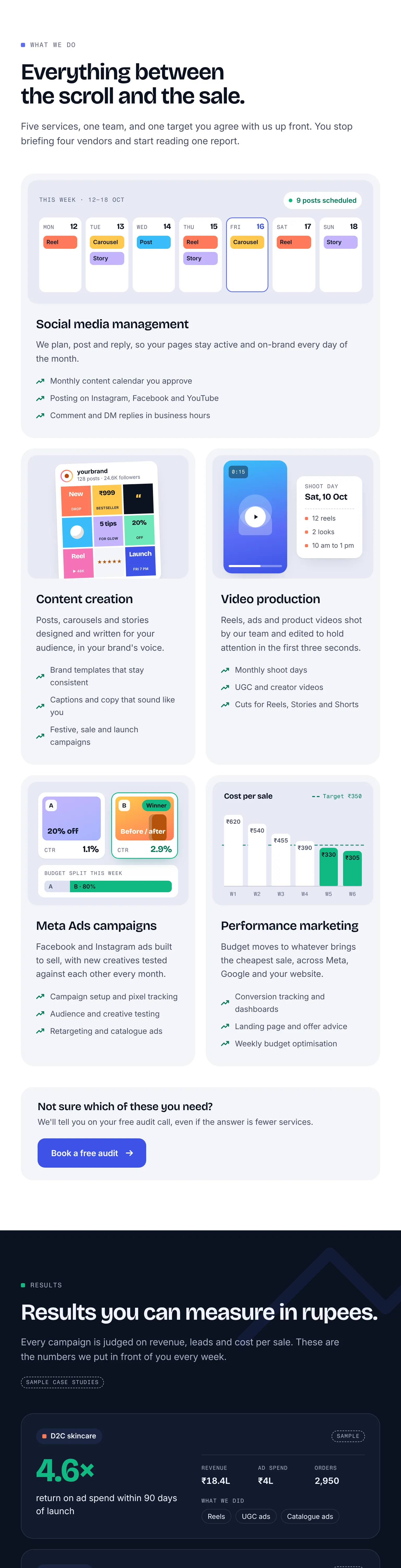
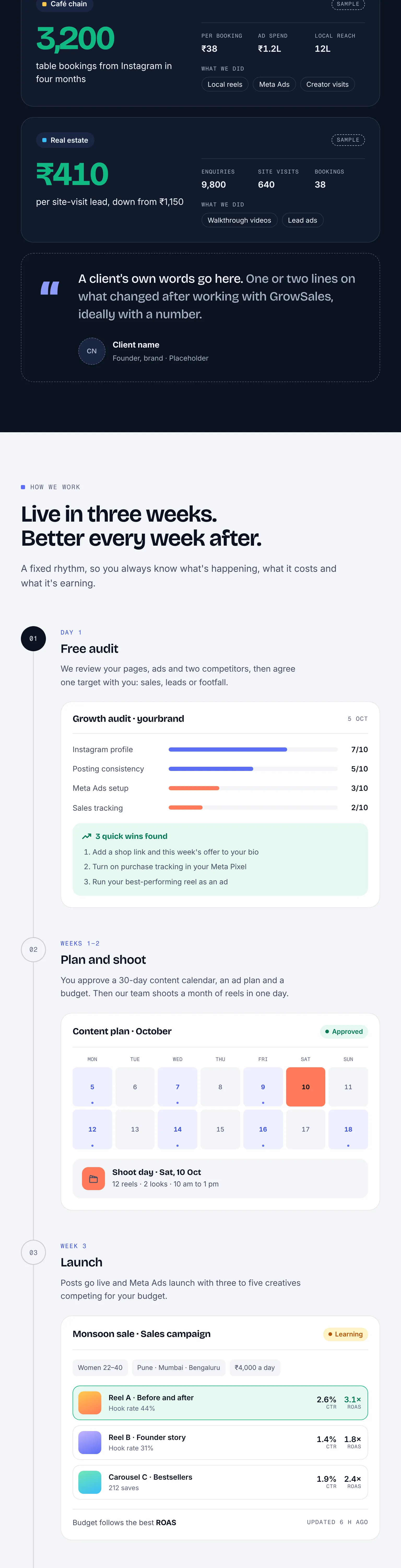
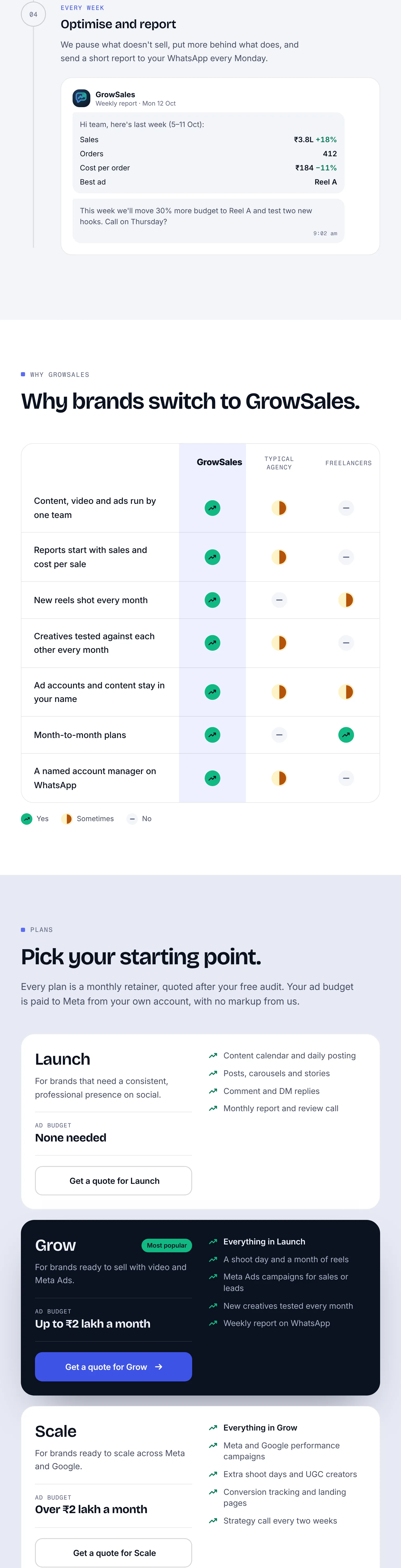
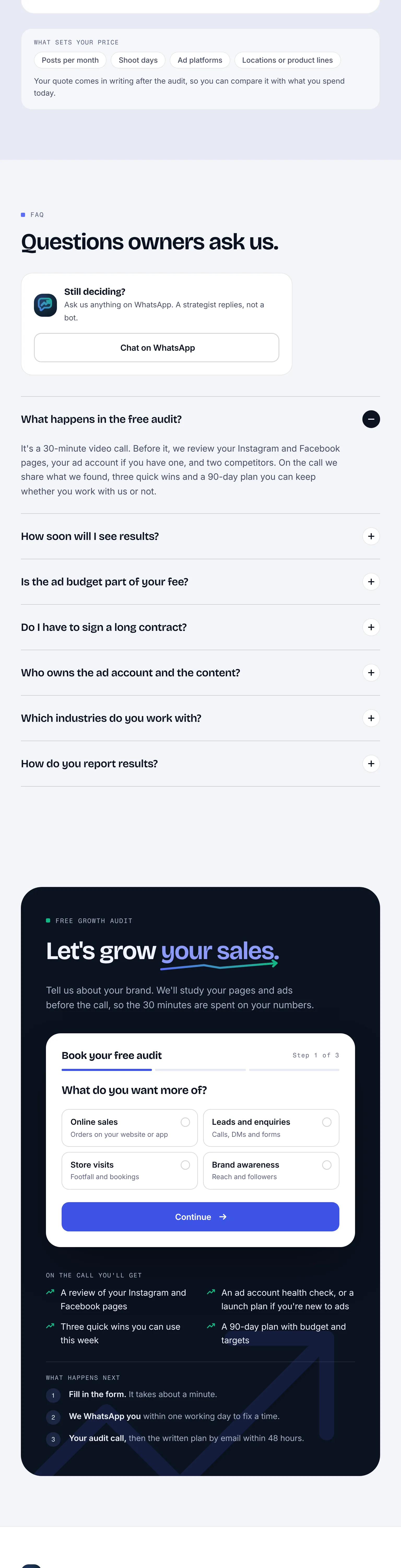







Rendered from the live code with reduced motion, so counters and animations show their final state. The concept bar and sticky mobile bar are hidden in the frames.
Everything marked Sample or Placeholder on the page, plus the wiring the preview leaves out.